CSS Theme Reference
A visual reference of CSS styling on the theme of this world.
This is the shiny page where you can go "ooooh, colours!" - my Style Manual goes into even more detail about how and where I use each of these elements! (For usage, please see my author's notes.)
Colours
The colours in my theme are distinct, have intentional uses, and have been applied throughout the world consistently. The colour combinations and font weights used in my theme currently meet or exceed level AA of the WCAG standards for accessible text.| Light | Normal | Dark | |
|---|---|---|---|
| Light | --melior-ll | --melior-l | --melior-ld |
| Interaction | --melior-il | --melior-i | --melior-id |
| Primary | --melior-pl | --melior-p | --melior-pd |
| Secondary | --melior-sl | --melior-s | --melior-sd |
| Dark | --melior-dl | --melior-d | --melior-dd |
- Light colours are used for all text on dark coloured backgrounds and for high contrast headings.
- Interaction colours are used for coloured headers and also links (all links are underlined). These are also used on :focus states so you can see what element you are about to interact with when you use tab or other methods to navigate a page.
- Primary colours are used for things of importance like certain headings, icons, and buttons.
I also use it to style my naughty #nsfw articles! - Secondary colours are used to inform, such as with comments, notifications, highlights, selections, and to note information or spoilers.
- Dark colours are used for background elements of the page or used for text on light backgrounds.
Typography
Fonts
MarcellusUsed for large headings and titles. IM Fell DW Pica
(regular and italic)
Used for some of the smaller headings and also used in quote boxes. Nunito (regular, italic, and extra bold)
Used everywhere else and as the main body text.
Headings
The visual hierarchy is about to get confusing on this article, but here's an example of how my article headings are styled:
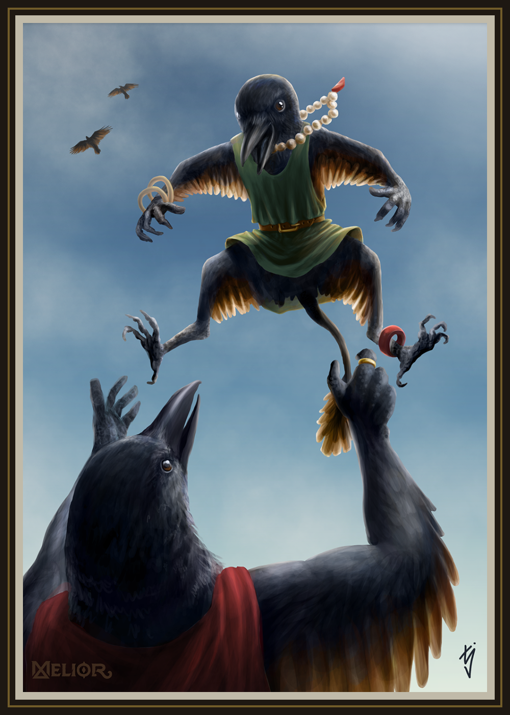
Corvidan parent and child by TJ Trewin
BBCode Heading One
Did you know that the World Anvil BBCode H1 is actually a H2 in HTML? Use your browser's inspect tool to see for yourself! This is because the developers of World Anvil wanted there to only be one HTML H1 on an article page, and that's the article title.BBCode Heading Two
The reason for having only one HTML H1 tag is for good SEO purposes and it also provides clear visual hierarchy by having the largest header at the top of the page.BBCode Heading Three
Smaller headings are great to use as subheadings of larger sections to talk about specific points in more detail. They also display differently depending on their order in an article's ToC.BBCode Heading Four
I like to use the smallest headings if I ever need a splash of colour in my article.Inline Text Elements
These are examples of all of the inline text elements used in World Anvil BBCode - I made myself a handy style manual on how exactly I use these in my world. The first big letter there is a dropcap. It looks super fancy but I rarely find the right place to use it. Maybe I should start using it in the introduction paragraph of my articles? What do you think?
This is an unordered list:
- This is an example of bold text in a sentence.
- Italic styling is excellent for emphasis in text.
- Underlined text looks very serious.
- I've made my strikethrough text look different:
it functions as a hover-over spoiler for sensitive content!
(I was inspired by Discord!)
And this is an ordered list:
- Superscript is floaty and really good for adding in references. [1]
- Subscript is smol and good for H2O.
- Small text is smaller than normal text.
- Redacted text is ██████████ top sekrit. No really. There's nothing there. It's been redacted. Or maybe burnt away?
Yes, I did change the colour.
Boxes
Quotes, Alouds, Indents, and Spoilers
This is an example of a blockquote and also a mockup link inside of the quote.
I bloody love CSS.
This is an example of an aloud box and also another mockup link to check the colours.
This is a mockup of a secret and also another mockup link to check the colours.
This is how I've styled my indented text. I prefer to use this as I don't use it for the intended purpose of formatting prose.
And this text is an expandable spoiler: Click to expand
This is an example of a spoiler and also a mockup link inside of it.
- ^This is the footnotes section and it's super useful for references.
[sup][anchor|fn1a][url:#fn1b][1][/url][/sup]
[ol][li][anchor|fn1b][url:#fn1a]^[/url]This is the footnotes section and it's super useful for references.[/li][/ol]


Oh, this is good! So well organized. I will use this as a guide/inspiration for my world!
__________ Check out my World! The New Realm
Don't forget to follow!