

Theme Development - Khorne
General
- Colour and Fonts- Text Format
- World Front Page
- Follower Panel
- Category Page
- Timeline CSS
- Map CSS
Misc
- Search Dropdown- Comment Section
- Article Tooltip
- Whitelabel
- Table of Contents
- World Sidebar
- Article Sidebar
- Links
- Buttons
- Notifications
- RPG-Sheets
- Dice PopUp
Templates
- Generic- Building
- Character
- Country
- Deity
- Geography
- Item
- Organization
- Religion
- Settlement
- Species
- Verhicle
- Session Report
- Condition
- Military Conflict
- Document
- Ethnicity
- Language
- Material
- Military Unit
- Myth
- Law
- Plot
- Profession
- Prose
- Rank
- Spell
- Technology
- Tradition
Colours and Fonts
Colour SwatchesThis section will show you your colour scheme and give you an idea, how well your standard text colour is readable on the respective colour.
Title Font
Latin
Aa Bb Cc Dd Ee Ff Gg Hh Ii Jj Kk Ll Mm Nn Oo Pp Qq Rr Ss Tt Uu Vv Ww Xx Yy Zz Àà Áá Ââ Ãã Ää Åå Ææ Çç Èè Éé Êê Ëë Ìì Íí Îî Ïï Ðð Ññ Òò Óó Ôô Õõ Öö × ÷ Øø Ùù Úú Ûû Üü Ýý Þþ ßÿ
Latin Ext
Āā Ăă Ąą Ćć Ĉĉ Ċċ Čč Ďď Đđ Ēē Ĕĕ Ėė Ęę Ěě Ĝĝ Ğğ Ġġ Ģģ Ĥĥ Ħħ Ĩĩ Īī Ĭĭ Įį İı IJij Ĵĵ Ķķ ĸ Ĺĺ Ļļ Ľľ Ŀŀ Łł Ńń Ņņ Ňň ʼn Ŋŋ Ōō Ŏŏ Őő Œœ Ŕŕ Ŗŗ Řř Śś Ŝŝ Şş Šš Ţţ Ťť Ŧŧ Ũũ Ūū Ŭŭ Ůů Űű Ųų Ŵŵ Ŷŷ Ÿ Źź Żż Žž ſ
Numbers
0 1 2 3 4 5 6 7 8 9 0
Symbols
! " $ % ^ & * ( ) _ + { } [ ] : ~ ; ' # , . < > / ? × ÷ ¡ ¢ £ ¤ ¥ ¦ § ¨ © ª « ¬ ® ¯ ° ± ² ³ ´ µ ¶ · ¸ ¹ º » ¼ ½ ¾ ¿ —
Headline Font
Latin
Aa Bb Cc Dd Ee Ff Gg Hh Ii Jj Kk Ll Mm Nn Oo Pp Qq Rr Ss Tt Uu Vv Ww Xx Yy Zz Àà Áá Ââ Ãã Ää Åå Ææ Çç Èè Éé Êê Ëë Ìì Íí Îî Ïï Ðð Ññ Òò Óó Ôô Õõ Öö × ÷ Øø Ùù Úú Ûû Üü Ýý Þþ ßÿ
Latin Ext
Āā Ăă Ąą Ćć Ĉĉ Ċċ Čč Ďď Đđ Ēē Ĕĕ Ėė Ęę Ěě Ĝĝ Ğğ Ġġ Ģģ Ĥĥ Ħħ Ĩĩ Īī Ĭĭ Įį İı IJij Ĵĵ Ķķ ĸ Ĺĺ Ļļ Ľľ Ŀŀ Łł Ńń Ņņ Ňň ʼn Ŋŋ Ōō Ŏŏ Őő Œœ Ŕŕ Ŗŗ Řř Śś Ŝŝ Şş Šš Ţţ Ťť Ŧŧ Ũũ Ūū Ŭŭ Ůů Űű Ųų Ŵŵ Ŷŷ Ÿ Źź Żż Žž ſ
Numbers
0 1 2 3 4 5 6 7 8 9 0
Symbols
! " $ % ^ & * ( ) _ + { } [ ] : ~ ; ' # , . < > / ? × ÷ ¡ ¢ £ ¤ ¥ ¦ § ¨ © ª « ¬ ® ¯ ° ± ² ³ ´ µ ¶ · ¸ ¹ º » ¼ ½ ¾ ¿ —
Body Font
Latin
Aa Bb Cc Dd Ee Ff Gg Hh Ii Jj Kk Ll Mm Nn Oo Pp Qq Rr Ss Tt Uu Vv Ww Xx Yy Zz Àà Áá Ââ Ãã Ää Åå Ææ Çç Èè Éé Êê Ëë Ìì Íí Îî Ïï Ðð Ññ Òò Óó Ôô Õõ Öö × ÷ Øø Ùù Úú Ûû Üü Ýý Þþ ßÿ
Latin Ext
Āā Ăă Ąą Ćć Ĉĉ Ċċ Čč Ďď Đđ Ēē Ĕĕ Ėė Ęę Ěě Ĝĝ Ğğ Ġġ Ģģ Ĥĥ Ħħ Ĩĩ Īī Ĭĭ Įį İı IJij Ĵĵ Ķķ ĸ Ĺĺ Ļļ Ľľ Ŀŀ Łł Ńń Ņņ Ňň ʼn Ŋŋ Ōō Ŏŏ Őő Œœ Ŕŕ Ŗŗ Řř Śś Ŝŝ Şş Šš Ţţ Ťť Ŧŧ Ũũ Ūū Ŭŭ Ůů Űű Ųų Ŵŵ Ŷŷ Ÿ Źź Żż Žž ſ
Numbers
0 1 2 3 4 5 6 7 8 9 0
Symbols
! " $ % ^ & * ( ) _ + { } [ ] : ~ ; ' # , . < > / ? × ÷ ¡ ¢ £ ¤ ¥ ¦ § ¨ © ª « ¬ ® ¯ ° ± ² ³ ´ µ ¶ · ¸ ¹ º » ¼ ½ ¾ ¿ —
Accent Font
Latin
Aa Bb Cc Dd Ee Ff Gg Hh Ii Jj Kk Ll Mm Nn Oo Pp Qq Rr Ss Tt Uu Vv Ww Xx Yy Zz Àà Áá Ââ Ãã Ää Åå Ææ Çç Èè Éé Êê Ëë Ìì Íí Îî Ïï Ðð Ññ Òò Óó Ôô Õõ Öö × ÷ Øø Ùù Úú Ûû Üü Ýý Þþ ßÿ
Latin Ext
Āā Ăă Ąą Ćć Ĉĉ Ċċ Čč Ďď Đđ Ēē Ĕĕ Ėė Ęę Ěě Ĝĝ Ğğ Ġġ Ģģ Ĥĥ Ħħ Ĩĩ Īī Ĭĭ Įį İı IJij Ĵĵ Ķķ ĸ Ĺĺ Ļļ Ľľ Ŀŀ Łł Ńń Ņņ Ňň ʼn Ŋŋ Ōō Ŏŏ Őő Œœ Ŕŕ Ŗŗ Řř Śś Ŝŝ Şş Šš Ţţ Ťť Ŧŧ Ũũ Ūū Ŭŭ Ůů Űű Ųų Ŵŵ Ŷŷ Ÿ Źź Żż Žž ſ
Numbers
0 1 2 3 4 5 6 7 8 9 0
Symbols
! " $ % ^ & * ( ) _ + { } [ ] : ~ ; ' # , . < > / ? × ÷ ¡ ¢ £ ¤ ¥ ¦ § ¨ © ª « ¬ ® ¯ ° ± ² ³ ´ µ ¶ · ¸ ¹ º » ¼ ½ ¾ ¿ —
Text Alignment
This is a basic paragraph with alignment left. Lorem ipsum dolor sit amet, consetetur sadipscing elitr, sed diam nonumy eirmod tempor invidunt ut labore et dolore magna aliquyam erat, sed diam voluptua. At vero eos et accusam et justo duo dolores et ea rebum.
This is a basic paragraph with alignment center. Lorem ipsum dolor sit amet, consetetur sadipscing elitr, sed diam nonumy eirmod tempor invidunt ut labore et dolore magna aliquyam erat, sed diam voluptua. At vero eos et accusam et justo duo dolores et ea rebum.
This is a basic paragraph with alignment right. Lorem ipsum dolor sit amet, consetetur sadipscing elitr, sed diam nonumy eirmod tempor invidunt ut labore et dolore magna aliquyam erat, sed diam voluptua. At vero eos et accusam et justo duo dolores et ea rebum.
This is a basic paragraph with alignment justify. Lorem ipsum dolor sit amet, consetetur sadipscing elitr, sed diam nonumy eirmod tempor invidunt ut labore et dolore magna aliquyam erat, sed diam voluptua. At vero eos et accusam et justo duo dolores et ea rebum.
Text Styles
This text contains a lot of formatting. For example, this text is bold, but this text should appear cursive. For good measure, I will also include some underlined and striked text. We can also have some fake blackout-text, like so: ███████ or add some highlighted text for importance. If you work with footnotes, you may want to add some Subtext or Supertext to mention this. Maybe add a Link to all of this as well.
Sometimes you may want to indent your text. Or maybe you think, that your normal font is too big, and you just want it smaller. All of this can be done with BB-Code! And did you know, that you can also add some Tooltips?
This is a BB-Code H1
This is a BB-Code H2
This is a BB-Code H3
This is a BB-Code H4
Lists
Ordered List
- List Item
- List Item
- List in List
- List in List
- List Item
- List Item
Unordered List
- List Item
- List Item
- List in List
- List in List
- List Item
- List Item
Mixed
- List Item
- List Item
- List in List
- List in List
- List Item
- List Item
Quotes, Alouds & Breadcrumbs
"This is a quote. Somebody had something to say!
This text is meant to be read to your players. Usually it will contain some sort of descriptive stuff!
Article Panels
Bootstrap Features - Grandmaster+ Territory
Alerts
You can create an alert by creating a custom container, and giving it the classes mentioned in the respective alert.
Buttons
You can create a button by creating a custom container with the classes given in the respective button. If you wrap it in a link, your button will link to another section of your world.
Progress Bar
Progress bars are a little bit tricky, but I like them! The construct of these is pretty simple, but it requires you to set the utility classes for the width manually, since we can't add inline-styles. First, create a custom container, that is called "progress". Within this container, setup another container and give it the "progress-bar" and your utility class. If you want to use standardized backgrounds, you can also add the bg-primary, bg-secondary, bg-success and so on classes on these.
In css, you will need to set the width of your utility class. For example, if you have a utility class of "pw-10" to indicate that you are 10% done, set the width of your utility class to 10%.If you want to add text, you can do so.
Adding the progress-bar-striped class to your inner container will give you a striped background, while progress-bar-animated will animate it. These are only usable with the standard-background classes, as far as I am aware.
Badges
Badges are a feature that comes in handy if you want to draw attention to something like an updated part. To add one, simply add a section (to have the badge inline), and give it the class mentioned in the respective badge.
badge bg-primary badge bg-secondary badge bg-info badge bg-success badge bg-warning badge bg-danger badge bg-light badge bg-dark
Cards
You can use cards to provide information and a link to a specific subject, to add some information, or just as a decorative thing. To add one, follow the instructions in the respective card.
With Header, Image, and Button

To create a card like this, create a custom container and call it "card". Inside this container, first add your image as usual. Then, you will add another container below the image and call it "card-body".
The card-body container holds the additional elements: a container called "card-title" with a bb-code h4 inside for your title, and the "card-text" container, which actually holds your description text.
If you also want to add a linked button, first add the link element as usual. Instead of the link-text, add a custom container for your button, and add the link text inside.
With Title, Text and Button
This card uses exactly the same code as the first one, but I stripped the image away.
Text only
Again, the basic structure remains, but I also deleted the title and the button from this one.
To change the background-color, you can simply add one of the bg- classes from bootstrap - or any you created yourself! Let's change the text color now:
Bootstrap offers a bunch of pre-defined text colors. To be precise, these ones:
- text-primary
- text-secondary
- text-success
- text-danger
- text-warning
- text-info
- text-light
- text-dark
- text-muted
- text-white
To make use of them, you can simply add the respective class to your custom container or section.
About background and text classes
The classes you've seen above make it very easy to create a quick, custom container. Especially, if you add your own and make use of the (also predefined) border-roundings and other things. Let's create a quick custom container, by creating it, and adding the following classes: bg-primary, text-light, border-primary, and rounded.
This needs some spacing, so let's just add the p-2 class to it!
That's much better, and a good starting point. And what you've seen here, is the reason why I recommend you to create your own background, text and border classes to save your colors and be able to thow something together really quick!
Additional Panels
These panels will adopt the style of your sidebar panels, and you can add them anywhere in your articles, on your front page, or even in your sidebar. To do so, just add a custom container with the classes "panel" and "panel-default". In addition, add a container inside, which has the class "panel-body". Then add your content, like this:
This is just a panel, which saves me a lot of time, because I will only need to style them once! Amazing!
Of course we do have some additional padding issues, which we could solve with the trusted "p-2" class! You can either do this, or just add the padding in your stylings!

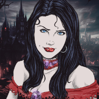
Fabled Legend Davina
Vampire loving servant of several chaotic forces.
Current Project: Die verlorenen Legionen
Text Alignment
This is a basic paragraph with alignment left. Lorem ipsum dolor sit amet, consetetur sadipscing elitr, sed diam nonumy eirmod tempor invidunt ut labore et dolore magna aliquyam erat, sed diam voluptua. At vero eos et accusam et justo duo dolores et ea rebum.
This is a basic paragraph with alignment center. Lorem ipsum dolor sit amet, consetetur sadipscing elitr, sed diam nonumy eirmod tempor invidunt ut labore et dolore magna aliquyam erat, sed diam voluptua. At vero eos et accusam et justo duo dolores et ea rebum.
This is a basic paragraph with alignment right. Lorem ipsum dolor sit amet, consetetur sadipscing elitr, sed diam nonumy eirmod tempor invidunt ut labore et dolore magna aliquyam erat, sed diam voluptua. At vero eos et accusam et justo duo dolores et ea rebum.
This is a basic paragraph with alignment justify. Lorem ipsum dolor sit amet, consetetur sadipscing elitr, sed diam nonumy eirmod tempor invidunt ut labore et dolore magna aliquyam erat, sed diam voluptua. At vero eos et accusam et justo duo dolores et ea rebum.
Text Styles
This text contains a lot of formatting. For example, this text is bold, but this text should appear cursive. For good measure, I will also include some underlined and striked text. We can also have some fake blackout-text, like so: ███████ or add some highlighted text for importance. If you work with footnotes, you may want to add some Subtext or Supertext to mention this. Maybe add a Link to all of this as well.
Sometimes you may want to indent your text. Or maybe you think, that your normal font is too big, and you just want it smaller. All of this can be done with BB-Code! And did you know, that you can also add some Tooltips?
This is a BB-Code H1
This is a BB-Code H2
This is a BB-Code H3
This is a BB-Code H4
Key-Value Pairs
Lists
Ordered List
- List Item
- List Item
- List in List
- List in List
- List Item
- List Item
Unordered List
- List Item
- List Item
- List in List
- List in List
- List Item
- List Item
Mixed
- List Item
- List Item
- List in List
- List in List
- List Item
- List Item
Quotes & Alouds
This is a quote. Somebody had something to say!
This text is meant to be read to your players. Usually it will contain some sort of descriptive stuff!
Article Panels
Bootstrap Features - Grandmaster+ Territory
Alerts
Buttons
Progress Bar
Badges
badge bg-primary badge bg-secondary badge bg-info badge bg-success badge bg-warning badge bg-danger badge bg-light badge bg-dark
Cards
With Header, Image, and Button


Kommentare