Age of Defiance New Years Resolutions 2024
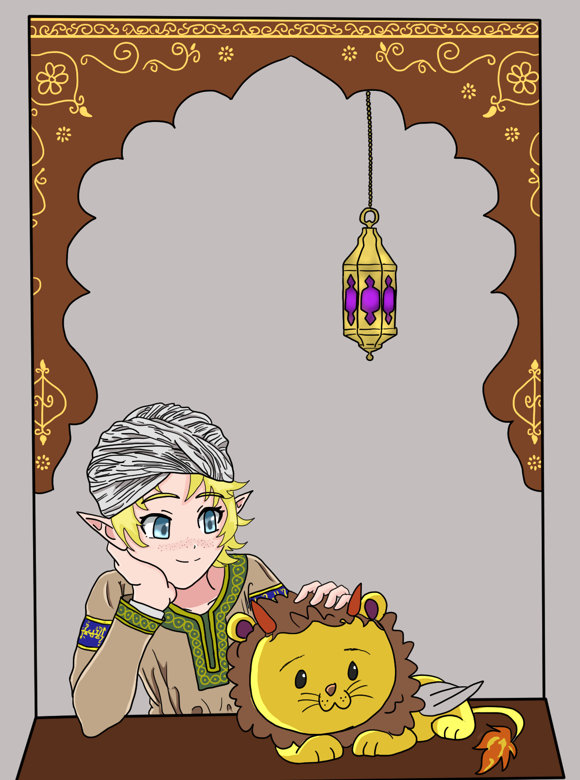
Even though I've been on WA since SC22 this is my first NYR I've done. Usually I skip over these odd-month challenges but I've come to learn they're quite useful for various reasons such as inspiration from other authors or knocking out new art pieces for future projects. I didn't expect to get as far as I did for WE23 challenges and yet I did, and I've got at minimum a few months to plan for the next major challenge. I actually wish I could have done more I had sketches made for un-written articles I either couldn't quite fit into the template I originally intended or just plum ran out of gas at the last minute. I thought I could squeak out at least ONE more entry but my body legit entered shutdown mode in the last few hours of the challenge so I just resigned myself to saving these projects for a future event. Because I wanted full-color artwork for each article I focused on art first before actually writing, and yet-its a nitpick of mine- I still wish I could have gone further. I did get what I want written at least including my first fully-fleshed out properly-formatted Vanguard character page, a setup I hope to use for future Vanguards.
Personally? My resolution aside from even MORE self-made hand-drawn artwork is to get started on importing season 2 of AoD, "Foes From Another World". In its earliest iteration it numbered 36 chapters before being trimmed down to 30. If I'm to keep with the "season" setup, I'll be splitting it up into 2 parts of 15 chapters each. Currently I'm breaking in an all-new rig for use with newer OS-specific projects, but its not without its kinks to work out. At least I still have the old rig to work with.
Here's to a new year of artwork, articles, bbcode, and bunts (from goober cats...)!
One of my favorite drawing apps is Realistic Paint Studio, because traditional paints and cats do not mix. I've messed with watercolor mode and drawing mode, but the oil mode I haven't really touched much. I used it to slop together one picture because I figured its supposed to be a messy painting on an aircraft chassis, but I really would like to experiment with it further. I'll also have to work on artwork for existing articles namely my "pillar" articles that I made when I first started writing.
All in all I had fun testing myself and pushing my skills to the limit. I actually weaned myself off of games to focus almost entirely on drawing and writing, though trying to format an article on a tablet while out of town isn't without its hazards...
I came to World Anvil not really expecting much, but I've come far over two years, hope to go farther, and feel I've finally found the right platform to display and share my ficverse. In order to pay it forward and give some love to those who've given me love unexpectedly, here's my favorite picks for WE23.
This is one of the earliest ones that jumped out at me, and I already favorited it, but I have to salute Callyxtus' efforts in both the storytelling and the ARTWORK! It's gorgeous the composition is incredible and I dig the old-school "Dragon Quest" style. I've never done a formation article since I can count on two fingers how many even EXIST in my world, but maybe in the future I can touch on one of these. I always enjoy seeing other styles when it comes to these setups.
I didn't get to do a tradition entry even though I had an idea jotted down, other categories took priority. I can't say I've read TJ's works before but the pixel style is cute. I grew up with old games like The Summoning and Bard's Tale III. Articles like these encouraged me to do more with BBC to maximize space, condense information, and spruce up an article until I'm basically dreaming in BBC.
Geography is another category that I didn't get to do. I had existing artwork, I had a subject planned, but as usual time got away from me. I was kind of apprehensive working with alternate history takes pertaining to AoD, but seeing this is encouraging. The page layout is crazy gorgeous, the sidebar effects are hypnotic, and just so happens Pirate: The Caribbean Hunt is one of my favorite games on the travel tablet. But it did not get much love on vacation since I spent most of my time pecking away writing while out of town...
I imagine there's some CSS wizardry involved to bypass the default template setup. The layout is super dense and eyecatching, I like the little table of contents popup from the side, and sometimes simplicity works best when it comes to art. I tried to pick out "newbies" for my NYR picks but some either abstained from WE or had nothing at all, so I figured why not check out Mochi's world for the first time. Am certainly amazed!
When I first saw the title I could only think of that one Austin Powers gag where the birdwatcher shouts "PECKER!!" I remember the format from the Ridiculous Chicken entry from Summer Camp its very compact and stands out from the usual vertical or blocky setups. Kind of makes me think of old school magazine articles you'd see in something like Zoobooks or 3-2-1 Contact.
I have no idea what any of this says but I always get a treat seeing Lia's world and layout. I'm guessing this has to do with game rules judging from the dice markers, so I guess its part of a manual? It's something new and different at least. TTRPGs are not my cup of tea but its interesting to see how pages are setup, and even though TTs' bore me to tears, there's actually characters in my ficverse who are total nerds into that stuff.
I tend to avoid certain templates like the plague because there are so few of a particular category in my ficverse, but it's still interesting to see what other people do. I love the artwork and the page setup kind of reminds me of a RPG manual I saw once at a HPB store but missed out on picking up. Even though RPGs are NOT my cup of tea the artwork and lore snippets always jump out at me. If I see that particular book again I'll have to pick it up.
One of my gripes with the use of AI is the fear that it'd supersede the vision. It's one thing if someone has two left thumbs to draw with, but the flip side of that is someone can simply get discouraged and not even try. Granted there have always been 'build your own' or 'paper doll' books heck I remember a 'build a monster' book as a kid that had various parts to trace onto paper to make critters. I got ePic Character Generator on sale last year and experimented with it and while its nice to toy with, I'd prefer my own sketches. I made a mockup for my recent Vanguard character but I'd had much older artwork that predated that so I stuck with the original design and refined it from there.
Ufff if I thought 7k words was a bit much for one article, Storms' got me beat. If there's a masterclass on page formatting and tweaking I'd strongly recommend new/younger writers taking it. Meh, I'm Texan, so go big or go home. Though the chest pic makes me think of this Skyrim-themed animated short where the hero goes through the trouble of getting to a chest to find a single gold coin and assorted garbage.
I'm guessing this is a fairly new world but given the community is replete with scifi and sword and sorcery its nice to see something that stands out. I see alot of potential here. Relies more on descriptions so the reader can form their own images. Look forward to seeing more on this. I can't remember the exact name of the movie I'm reminded of an old 60's-ish Christmas film where kids have to help Santa get enough presents to deliver with a bit of modern tech blended in.


aaa thank you so much for including Monster Hunting! <3 I'm so glad my article made a good first impression :D